Comparison dashboard (role-based dashboard)
Learn how to compare data in your role-based dashboard.
You might be familiar with the Comparison dashboard in your Survey dashboards. We also offer this feature in your role-based dashboard!
Please note:This dashboard does not pull data from the following surveys:
- Career Page survey
- "Candidate applied", also known as "Confirmation Email" survey.
- Hiring Manager survey
- Other internal surveys such as Internal Partnership surveys
- Quality of Hire or Onboarding surveys
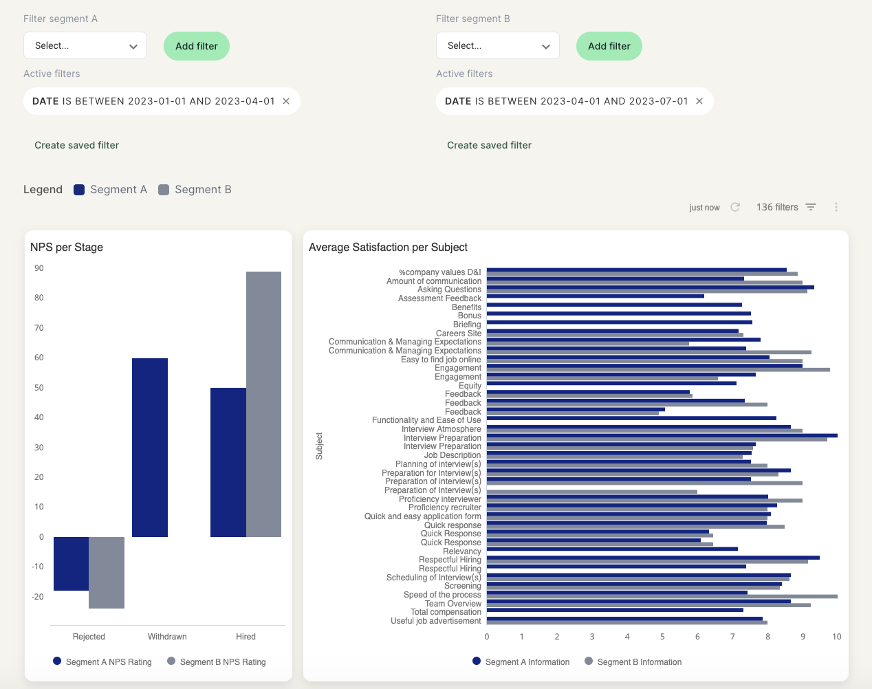
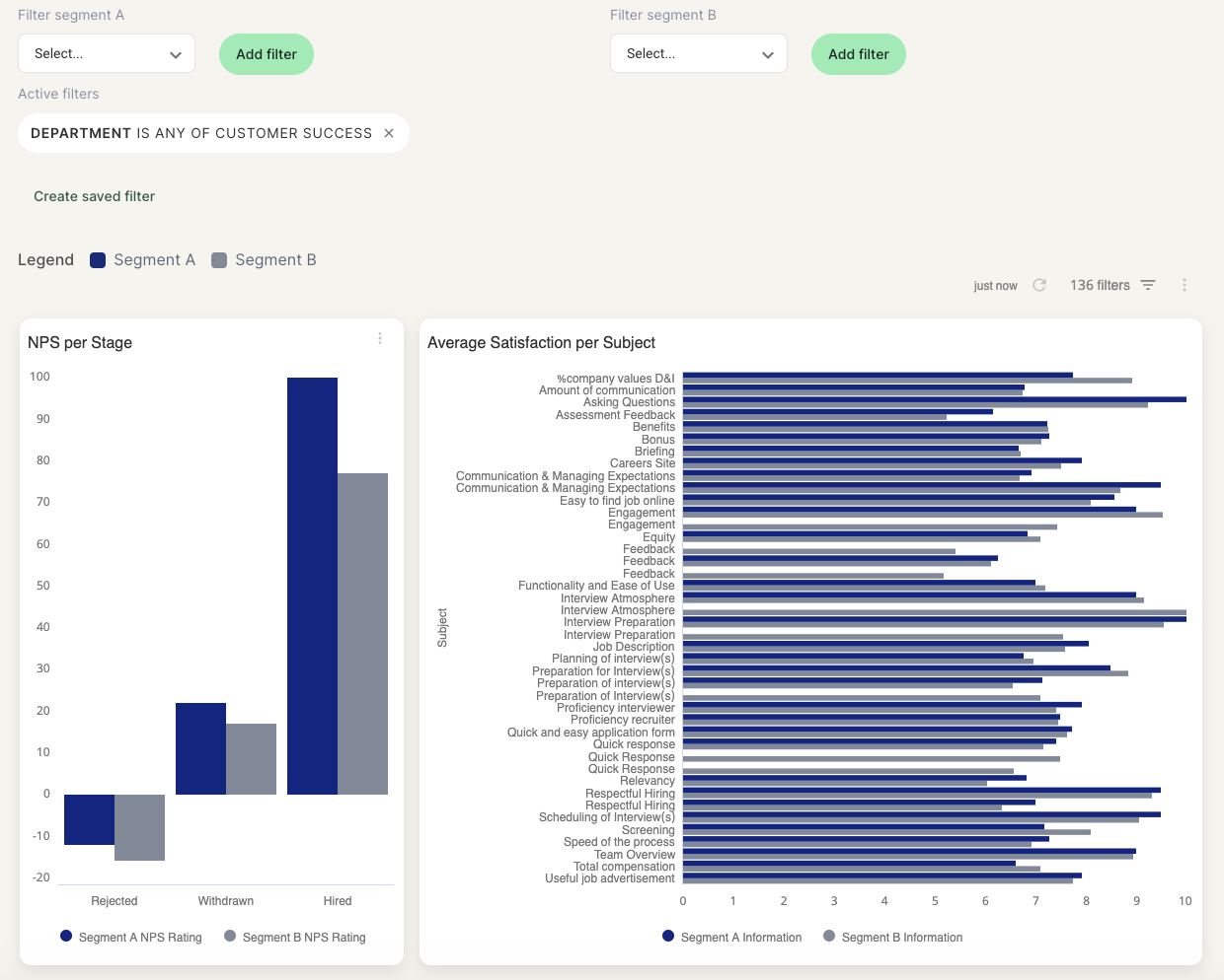
Your Comparison dashboard will allow you to compare NPS per Journey Stage and Satisfaction per Subject based on the filters you apply.
In the Comparison tab you can add filters to compare results to each other or to your company benchmark.
Once you have applied your desired filters, the dashboard will display the two filtered views:
- At the top you will see the number of responses and response rates of the two
- Segment A will be displayed above in a blue color and Segment B will be underneath, in a gray color.
Comparing two sets of filters
To compare two sets of filters, you can add one or more filters in the Segment A and one or more filters in the segment B, like in the following example where we're comparing two quarters with each other:
Comparing to the overall company results
To compare one set of filters to your company benchmark, you can add one or more filters in the Segment A and leave Segment B blank, like in the following example where we're comparing the results of one department against overall company results:
Please note:If your user profile is added to a Data Access Policy, you will be able to use the comparison dashboard but all results will be filtered based on your data restriction. This means that you might not be able to compare your results to the company overall results.
Updated 10 months ago