Comparison dashboard
Learn how to compare data in the Starred dashboard.
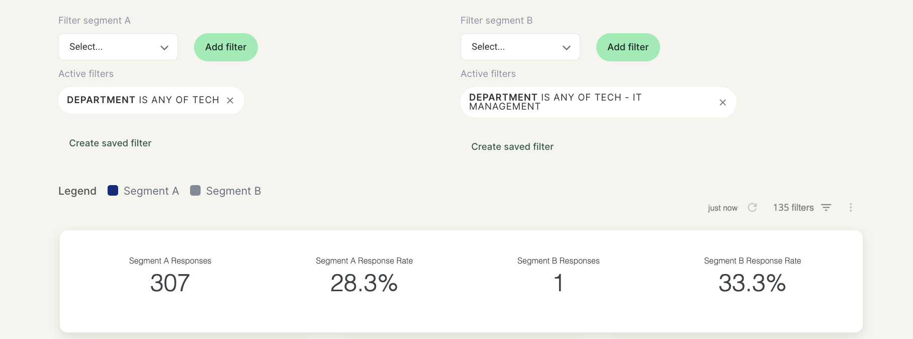
Would you like to know how your NPS changed from the last quarter to now, or compare the results from two different departments? You can do all of this by selecting the Comparison tab in your Starred survey dashboard.
Here, you’ll be able to choose which filters you want to compare with each other by using the available filters.
Filtering in the Comparison dashboard works the same as in the main dashboard, the only difference will be that you have two segments to select:
- to segment A you will add the filters for your filtered view
- to segment B you'll add the filters for the second filtered view (you can leave it empty if you wish to compare to the overall results)
Please note:
- If you want to compare a filtered view to the overall company results, you can leave segment B empty.
- If your user profile is added to a Data Access Policy, you will be able to use the comparison dashboard but all results will be filtered based on your data restriction. This means that you might not be able to compare your results to the company overall results.
Updated 11 months ago
Did this page help you?