Benchmark
The Starred Benchmark is a dashboard that allows you to compare your company results to those of other Starred customers. The data displayed is updated every hour.
How to read the Benchmark
The Benchmark offers 3 separate tabs, to analyze:
- NPS
- Response rate
- Questions
The Benchmark dashboard is updated only once a month.
The main resource you'll find is a graph that displays the rating/score/percentage on the X axis and the touchpoint (rejected, withdrawn, etc.) on the Y axis.
Please note: All three benchmarks display data from the touchpoints Hired, Withdrawn, Rejected (all of them) and Hiring Manager. Onboarding is excluded.
We use 4 colors to make it easier for you to visualize in which "group" your company falls, between companies that are in the bottom 25%, companies that are in lower-mid 25%, higher mid 25% or top 25%. Where you fall is marked with a black diamond-shaped symbol.
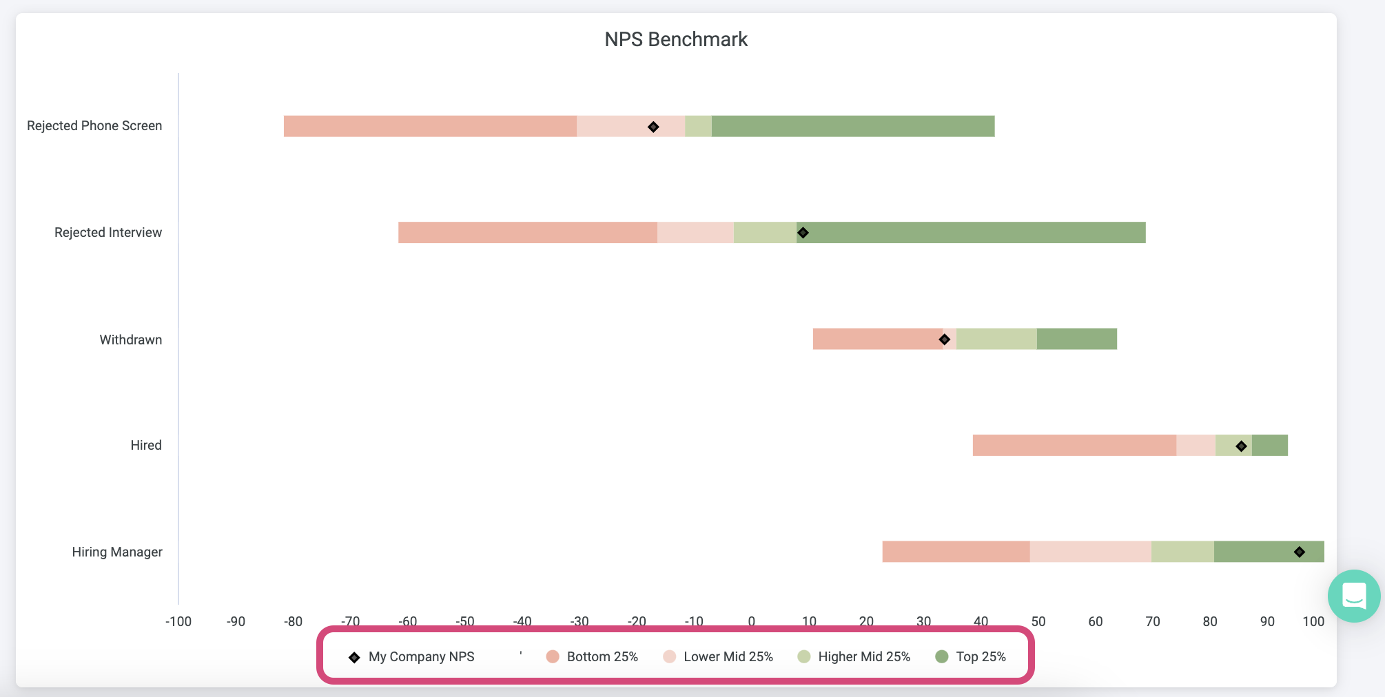
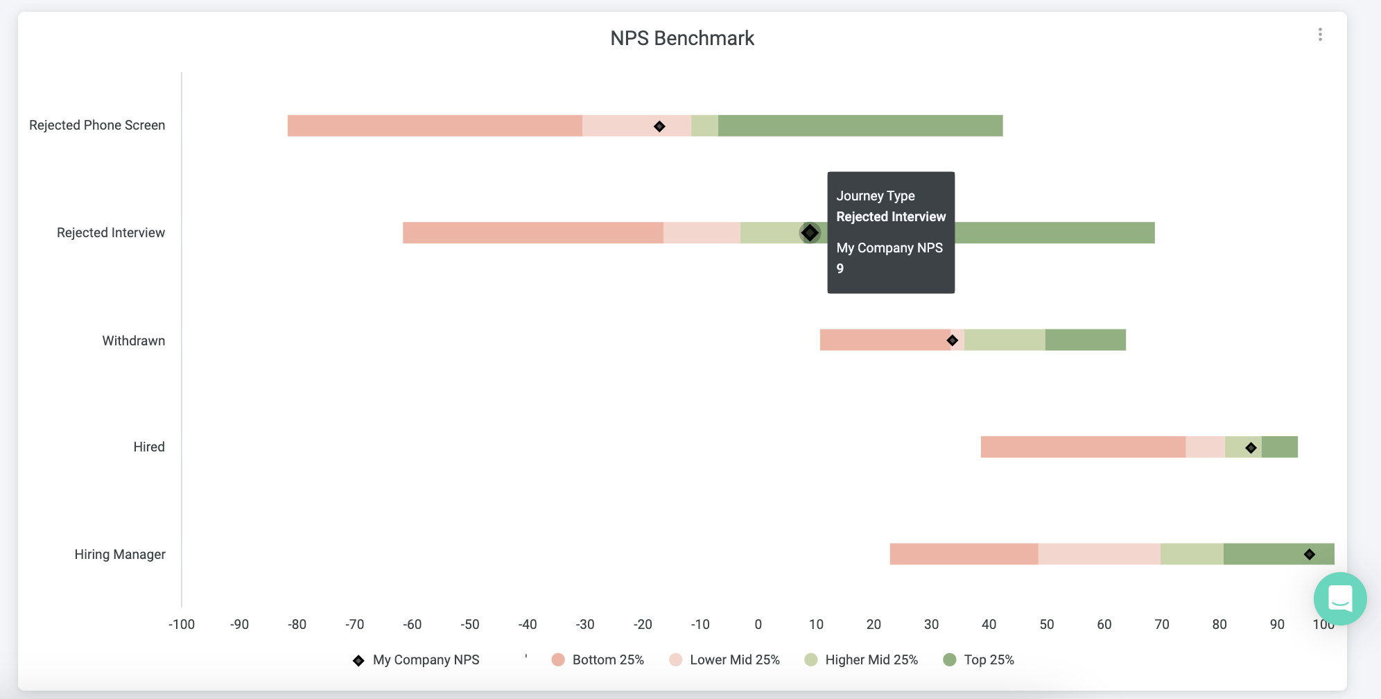
NPS Benchmark
This tab is where you can compare your NPS scores for each touchpoint to those of other companies.
Please note:
- Starred will only include data points with at least 20 responses. If you have one touchpoint will less than 20 responses, your data won't temporarily count towards the Benchmark and your touchpoint will not show up until you have at least 20 responses.
- The data is only per complete month. For instance, if you have put your surveys live in November and received 19 responses in November, and then one more response in December, the data will not be shown in the benchmark.
For your NPS Benchmark, the X axis will display scores from -100 to 100.
By hovering over the colors in the graph, you'll be able to see exactly how much that section is scoring. For instance, in the screenshot below you can see that a company with NPS score 9 for the Rejected interview touchpoint is right in the Higher Mid 25%.
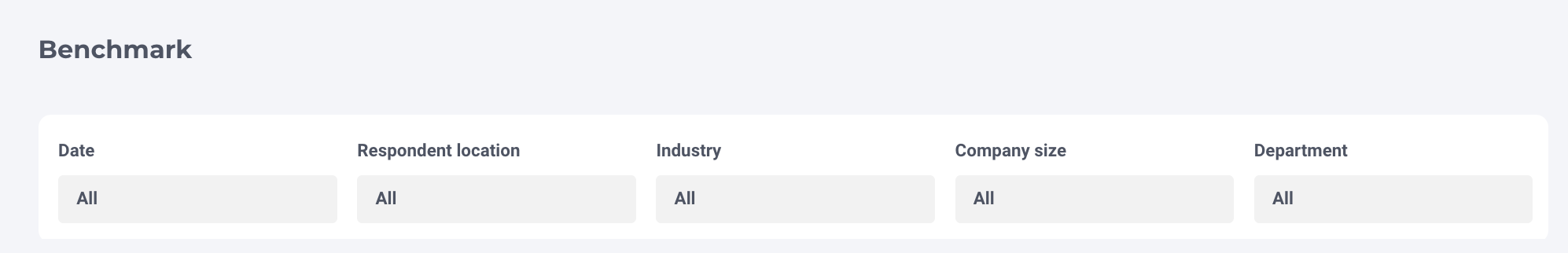
Filters
To narrow down your data, you can use the filters above the table, namely:
- Date
- Respondent location
- Industry
- Company size
- Department
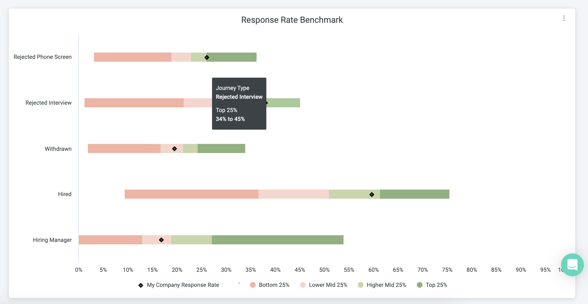
Response rate benchmark
This tab is where you can compare your response rate for each touchpoint to that of other companies.
Please note that Starred will only include data points with at least 50 invitations. If you have one touchpoint will less than 50 invitations, your data won't temporarily count towards the Benchmark and your touchpoint will not show up until you have at least 20 responses.
For your Response Rate Benchmark, the X axis will display a percentage from 0% to 100%.
By hovering over the colors in the graph, you'll be able to see exactly how much that section is scoring. For instance, in the screenshot below you can see that customers that are in the top 25% have an response rate that ranges between 34% and 45%.
Filters
To narrow down your data, you can use the filters above the table, namely:
- Date
- Industry
- Company size
- Department

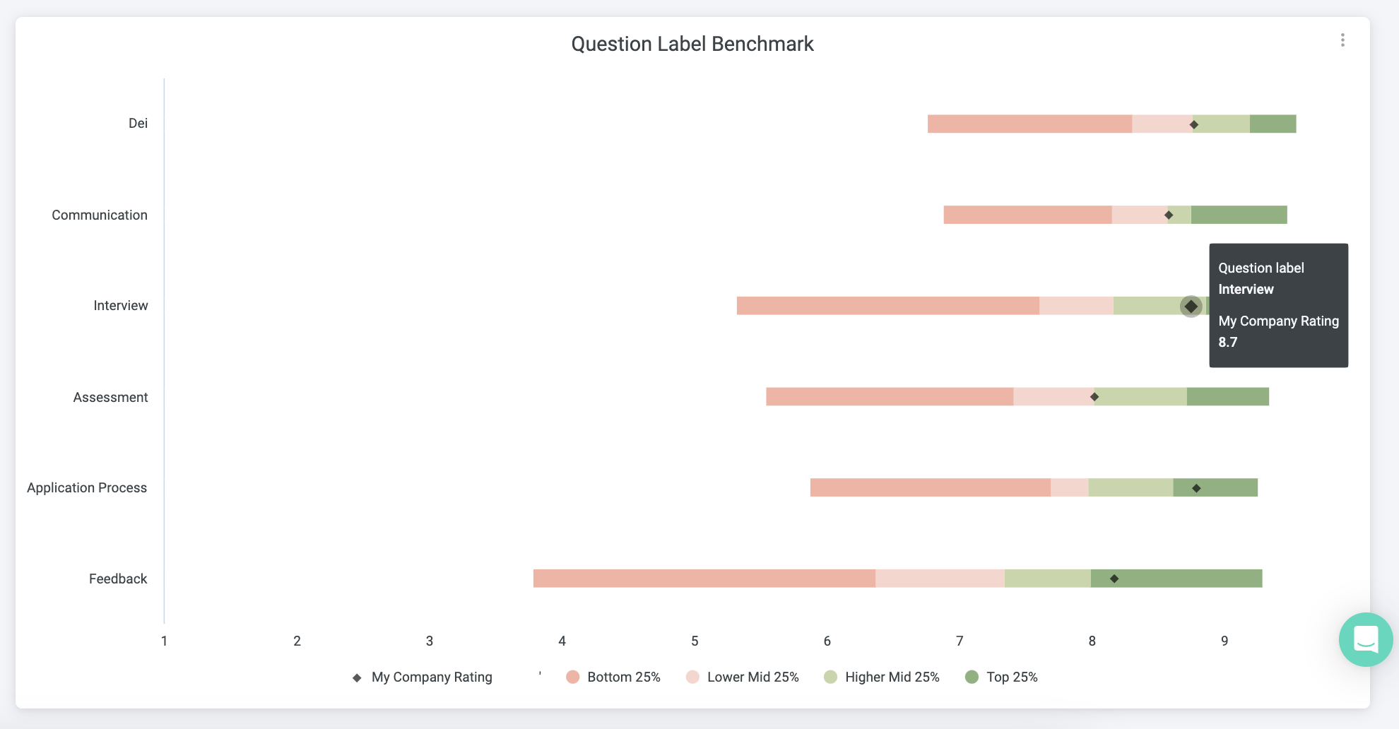
Questions benchmark
This tab is where you can compare your ratings for each subject to those of other companies.
For your Questions Benchmark, the X axis will display ratings* from 1 to 10. Ratings come from your grades and star question. Please refer to our Support page on survey question types to learn more.
By hovering over the colors in the graph, you'll be able to see exactly how much that section is scoring. For instance, in the screenshot below you can see that for the question label Interview a company rating of 8.7 is right in the Higher Mid 25%.
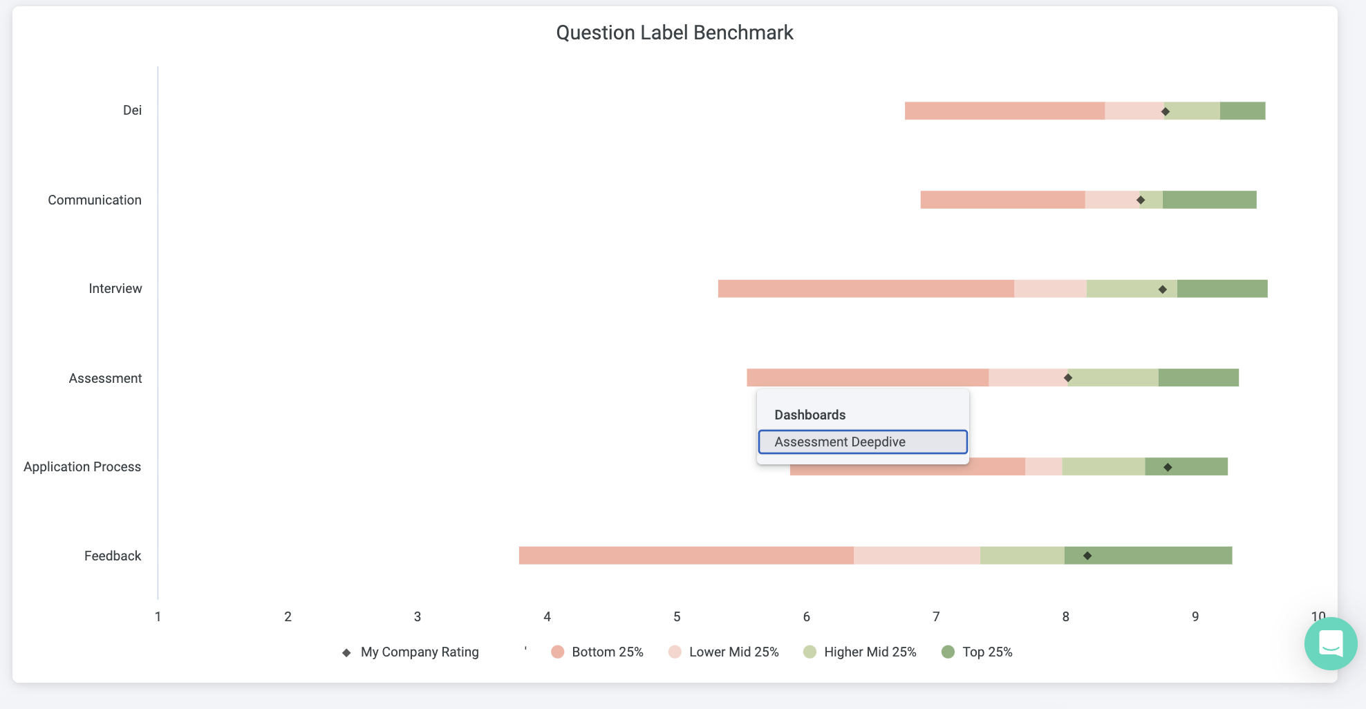
Subject deepdive
From here, you can also access a Deepdive dashboard for each of the subjects. Just click on the colored bars and an option to open a separate deepdive dashboard will appear:
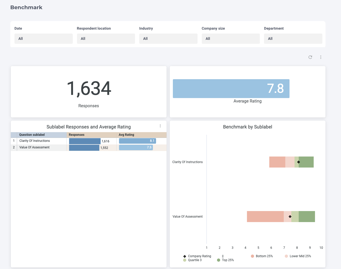
In the Deepdive dashboard, you can view even more insights, such as the sublabel scores and nr. of responses, the label benchmark by journeytype and the question to labels mappings.
Filters
To narrow down your data, you can use the filters above the table, namely:
- Date
- Respondent location
- Industry
- Company size
- Department

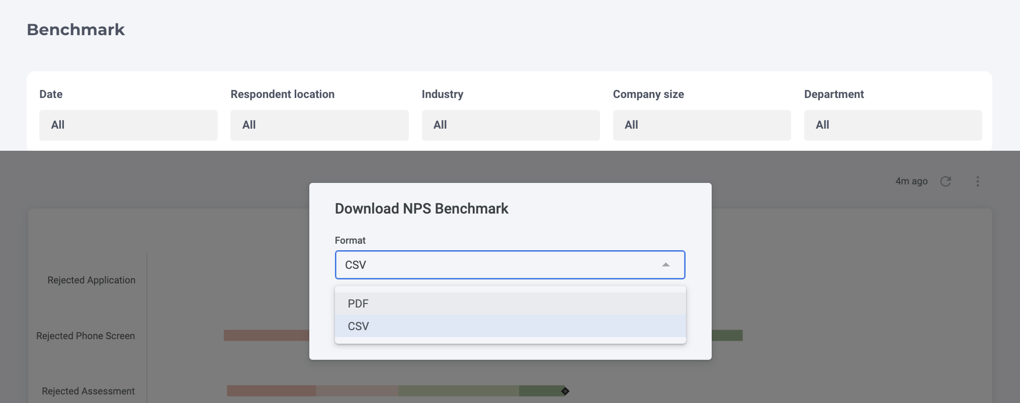
Exporting your results
As with any other Starred dashboard, you have the option to export your data.
At the top right corner, you'll find three vertical dots: click on them and select Download.
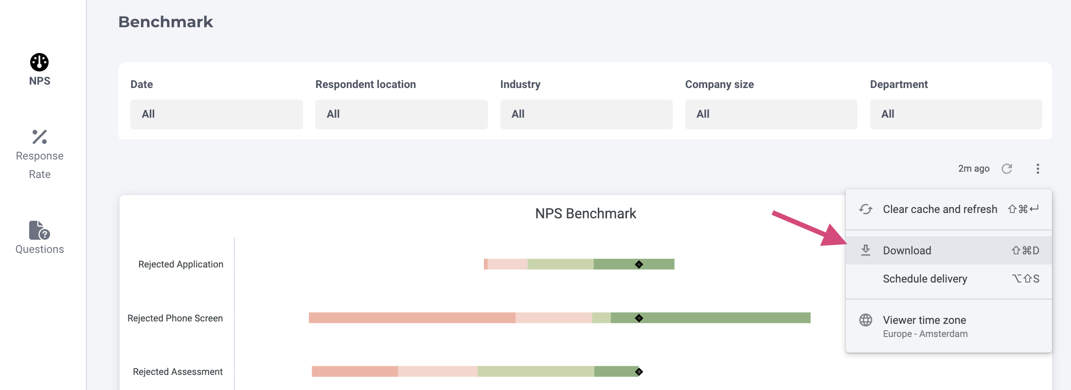
You can then choose between PDF and CSV.
For more in-depth information on exporting your results and what format is recommended, you can check out our dedicated video or written article.
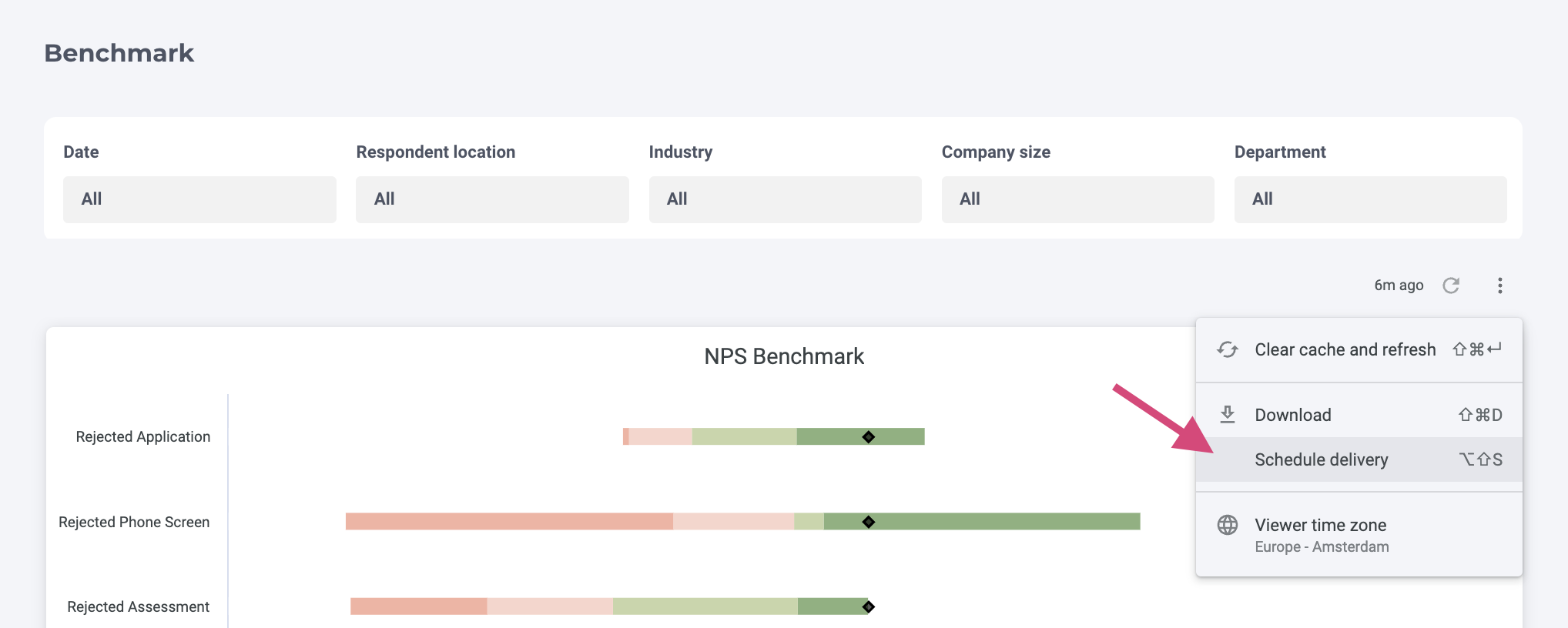
Scheduling reports
You also have the option to schedule the delivery of the dashboard to another team member, whether they are a Starred user or not.
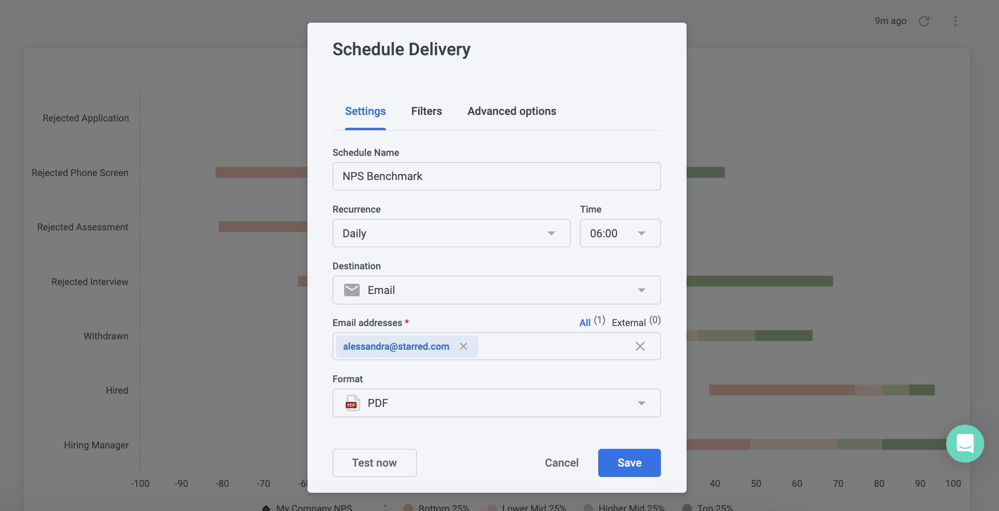
At the top right corner, click on the three vertical dots and select Schedule delivery.
A pop-up window will appear where you can define further details. Please refer to our video or written article for more instructions on scheduling the delivery survey results.
Updated 10 months ago