Matrix
Define priorities based on your analytics.
When you know the average satisfaction of all aspects of your survey, a question that follows is "What should I improve first?"
No worries, we got you covered!
The Starred Matrix shows you which aspects of your recruitment process have the highest potential for improvement based on their correlation with the NPS score.
How the impact is calculated
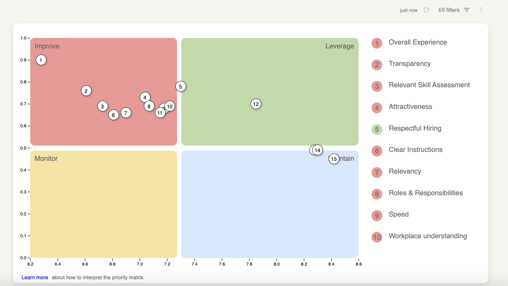
As you might have noticed, the Matrix looks like a Cartesian system with an X-axis and a Y-axis.
On the X-axis, it displays the score; while the Y-axis refers to the impact that a particular aspect has on the Net Promoter Score.
All aspects are plotted based on their average score and their impact (correlation) on the Net Promoter Score, ranked from highest to lowest.
The impact is based on the following formula:
Correlation * (10-satisfaction)
10 - satisfaction is the room for improvement. Every aspect that scores very high on this part of the equation has more room for improvement. (i.e. candidates are unsatisfied with this aspect thus it makes it a higher priority),
If you multiply this with the correlation for a question, you end up with the expected improvement in NPS.
Note: To be able to calculate the Priority Matrix, you need at least 20 respondents that answered the NPS (or CES/CES2) question and rated a minimum of 3 individual aspects.
How to read the Matrix
There are essentially 4 levels in the Matrix, which are highlighted in different colors for your convenience. Based on the average score and the calculated impact on the NPS, an action is recommended:
- RED: Low average score, High impact: Improve
No way around it, you have to improve these aspects - GREEN: High average score, High impact: Leverage
These aspects are your strengths. Leverage them, to further differentiate from competitors - YELLOW: Low average score, Low impact: Monitor
These aspects are less important and the average satisfaction is low. No action required, but ask yourself: How much-added value does this question have in the survey? - BLUE: High average score, Low impact: Maintain
Maintain these aspects and their benefits for your respondents. The impact on NPS is, however, limited.
The Matrix also includes a TOP 10 ranking on the right side.
By clicking on one of the numbers in the Priority Matrix, you’ll get more details on the full question asked, the responses received, the average score and the correlation to the NPS.
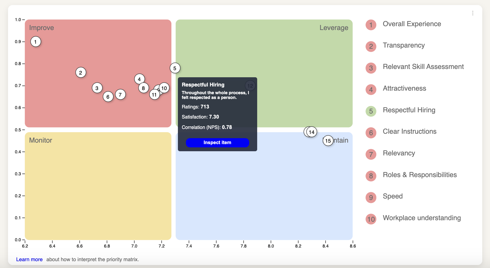
Please note:The questions are displayed based on the question description, not the title of the question.
That is because a question with the title "feedback" could relate to different stages of the recruitment process: feedback from the assessment, feedback from an onsite interview, and so on.
This could mean that you can have different "feedback" subjects listed in the chart. If you wish to keep them all together, you can update the question description so they match.
Updated 11 months ago