Main dashboard
The main dashboard offers an aggregate overview of the data from all your candidate journey types (rejected, withdrawn and hired).
Please note:This dashboard does not pull data from the following surveys:
- Career Page survey
- "Candidate applied", also known as "Confirmation Email" survey.
- Hiring Manager survey
- Other internal surveys such as Internal Partnership surveys
- Quality of Hire or Onboarding surveys
Invitations, responses and response rate
These numbers are a sum of all sent invitations, received responses and response rate.

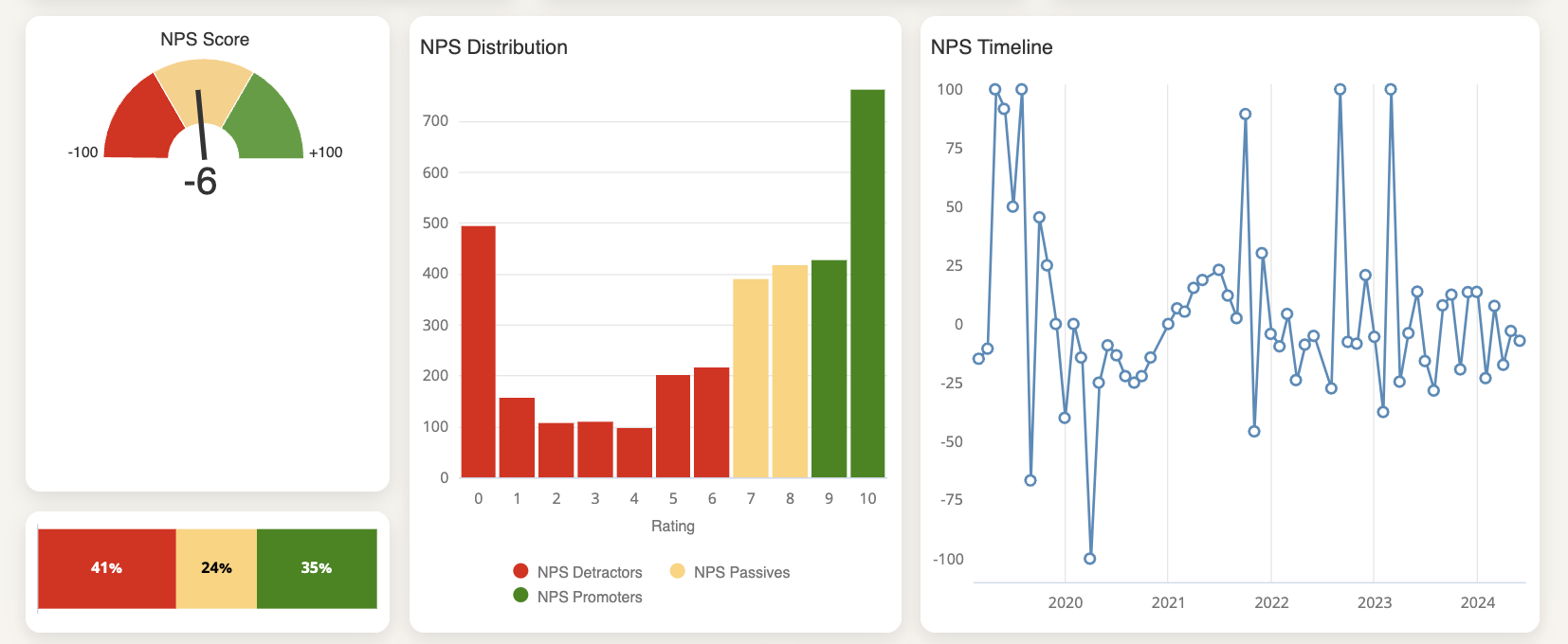
NPS
The next blocks will give you insights into your NPS score, NPS distribution and timeline.
- NPS score: displayed using color codes to help visualize your numbers.
- NPS DIstribution: visualization of the distribution of your NPS ratings, from 0 to 10.
- NPS Timeline: this graph shows how your NPS score has developed over time.
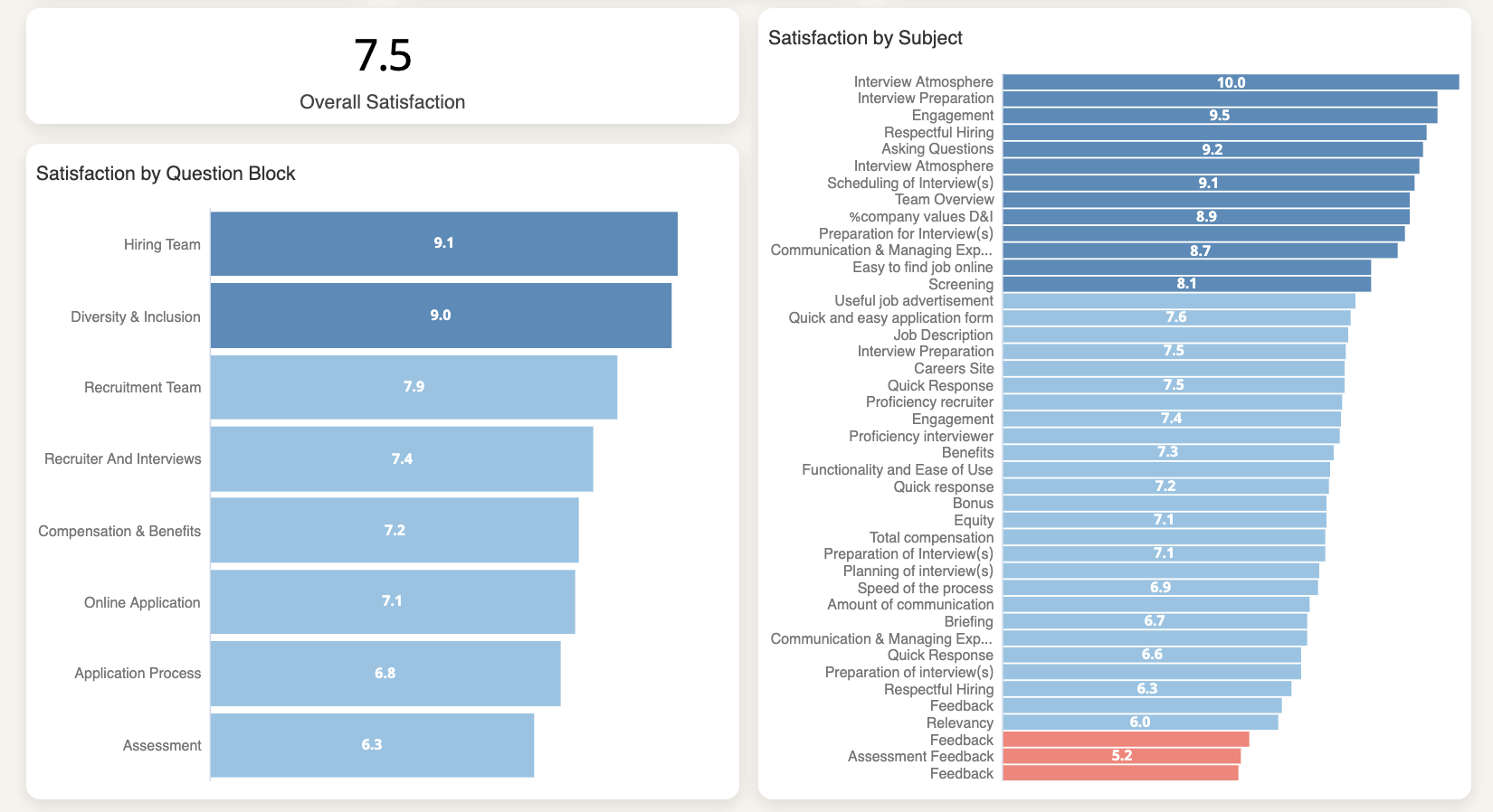
Average satisfaction per subject
Starred also offers other types of questions such as star and grade questions. These are divided by subject.
In the next blocks you’ll be able to see:
- Overall satisfaction: average of the ratings received for star and grade questions
- Satisfaction by question block: a breakdown of your ratings per question block
- Satisfaction by subject: a breakdown of your ratings per subject
Colors will help you identify your strengths and opportunities for improvement.
If you click on a specific subject you will be able to drill down into the question block.
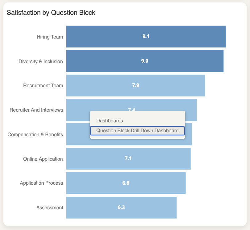
Please note:The questions are displayed based on the question description, not the title of the question.
That is because a question with the title "feedback" could relate to different stages of the recruitment process: feedback from the assessment, feedback from an onsite interview, and so on.
This could mean that you can have different "feedback" subjects listed in the chart. You can find out the question that the subject refers to by hovering over the subject title ("Engagement" in the example below):
If you wish to group all questions together under one subject (let's say, all "feedback" questions) you can update the question descriptions so they match.
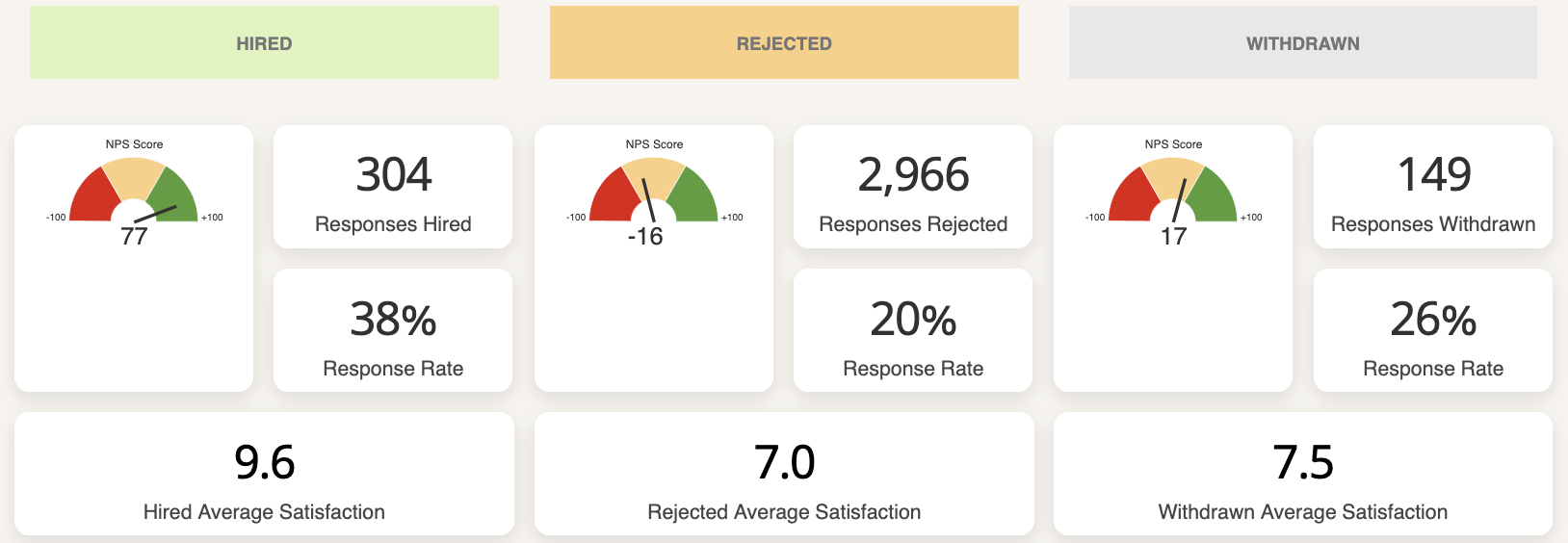
Data for rejected, hired and withdrawn candidates
Hired candidates will give higher scores than withdrawn and rejected candidates, so a deep dive into the specific results for each touchpoint is necessary to really understand what your candidates think of you.
At the bottom of the main dashboard you’ll see the same data, which is:
- NPS Score
- Responses
- Response rate
- Average satisfaction
But this time it will be broken down based on hired, rejected and withdrawn candidates.
Updated 10 months ago